
Bucket FICO Scores
FICO scores are typically the "Go-To" method in taking preventative measures for loss provision and are utilized to provide a good indication of how likely a customer is to default on their mortgage.
Considering this, we are going to build a machine learning model that will predict the probability of default utilizing the mortage book we had used in a previous task (Credit Risk Analysis), but the catch is that the architecture we are using requires categorical data!!! As FICO ratings can take integer values in a large range, they will need to be mapped into buckets. We will have to research the best way of doing this to allow to efficiently analyze the data.
A FICO score is a standardized credit score created by the Fair Isaac Corporation (FICO) that quantifies the creditworthiness of a borrower to a value between 300 to 850, based on various factors. FICO scores are used in 90% of mortgage application decisions in the United States. A risk manager will typically provide the researchers FICO scores for the borrowers in the bank’s portfolio, to which we will need to construct a technique for predicting the PD (probability of default) for the borrowers using these scores.
We would ideally strive to make the model work for future data sets, so this will need a general approach to generating the buckets. Given a set number of buckets corresponding to the number of input labels for the model, lets find out the boundaries that best summarize the data! To do this we will first need to create a rating map that maps the FICO score of the borrowers to a rating where a lower rating signifies a better credit score.
The process of doing this is known as quantization. One could consider many ways of solving the problem by optimizing different properties of the resulting buckets, such as the mean squared error or log-likelihood (see below for definitions). For background on quantization, see here.
Mean squared error
You can view this question as an approximation problem and try to map all the entries in a bucket to one value, minimizing the associated squared error. We are now looking to minimize the following:

Log-likelihood
A more sophisticated possibility is to maximize the following log-likelihood function:
Where bi is the bucket boundaries, ni is the number of records in each bucket, ki is the number of defaults in each bucket, and pi = ki / ni is the probability of default in the bucket. This function considers how rough the discretization is and the density of defaults in each bucket. This problem could be addressed by splitting it into subproblems, which can be solved incrementally (i.e., through a dynamic programming approach). For example, you can break the problem into two subproblems, creating five buckets for FICO scores ranging from 0 to 600 and five buckets for FICO scores ranging from 600 to 850. Refer to this page for more context behind a likelihood function. This page may also be helpful for background on dynamic programming.
The First Step is to import the necessary libraries for this Task.
import pandas as pd
from math import log
import os

cwd = os.getcwd()

print("current working directory: {0}".format(cwd))

print ("os.getcwd() returns an object type {0}".format(type(cwd))))

# copy filepath
os.chidr ("________")


df = pd.read_csv('Loan_Data.csv')

x = df['default'].to_list()
y = df['fico_score'].to_list()
n = len(x)
print (len(x), len(y))

default = [0 for i in range(851)]
total = [0 for i in range(851)]

for i in range(n):
    y[i] = int(y[i])
    default[y[i]-300] += x[i]
    total[y[i]-300] += 1

for i in range(0, 551):
    default[i] += default[i-1]
    total[i] += total[i-1]
To perform some more statistical tests we are going to have to import another tool to understand the log likelihood for out data set.
import numpy as np

def log_likelihood(n, k):
    p = k/n
    if (p==0 or p==1):
        return 0
    return k*np.log(p)+ (n-k)*np.log(1-p)

r = 10
dp = [[[-10**18, 0] for i in range(551)] for j in range(r+1)]

for i in range(r+1):
    for j in range(551):
        if (i==0):
            dp[i][j][0] = 0
        else:
            for k in range(j):
                if (total[j]==total[k]):
                    continue
                if (i==1):
                    dp[i][j][0] = log_likelihood(total[j], default[j])
                else:
                    if (dp[i][j][0] < (dp[i-1][k][0] + log_likelihood(total[j]-total[k], default[j] - default[k]))):
                        dp[i][j][0] = log_likelihood(total[j]-total[k], default[j]-default[k]) + dp[i-1][k][0]
                        dp[i][j][1] = k

print (round(dp[r][550][0], 4))

k = 550
l = []
while r >= 0:
    l.append(k+300)
    k = dp[r][k][1]
    r -= 1

print(l)
Output():
10000 10000
-4217.8245
[850, 753, 752, 732, 696, 649, 611, 580, 552, 520, 300]
To help further understand and visualize or data, lets create some visually appealing descriptive analysis to paint a story for our data!
import pandas as pd
import matplotlib.pyplot as plt
import seaborn as sns
# Load the loan borrower data
data = pd.read_csv('./Loan_Data.csv')
# Descriptive Analysis
# Histogram of FICO Scores
plt.figure(figsize=(8, 6))
sns.histplot(data['fico_score'], bins=20, kde=True)
plt.title('Distribution of FICO Scores')
plt.xlabel('FICO Score')
plt.ylabel('Frequency')
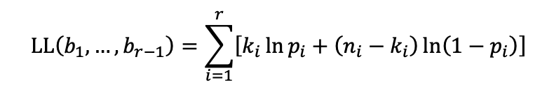
plt.show()This will allow us to visualize our Frequency Distribution of FICO Scores
# Boxplot of Loan Amount by Default
plt.figure(figsize=(8, 6))
sns.boxplot(x='default', y='loan_amt_outstanding', data=data)
plt.title('Loan Amount by Default')
plt.xlabel('Default')
plt.ylabel('Loan Amount')
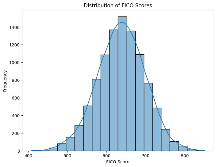
plt.show()This visualization allows for a more in depth comparison of Outstanding Loan Amounts to better predict the probability of Default of individuals
# Scatter plot of FICO Score vs. Debt-to-Income Ratio
plt.figure(figsize=(8, 6))
sns.scatterplot(x='fico_score', y='total_debt_outstanding', data=data, hue='default')
plt.title('FICO Score vs. Debt-to-Income Ratio')
plt.xlabel('FICO Score')
plt.ylabel('Debt-to-Income Ratio')
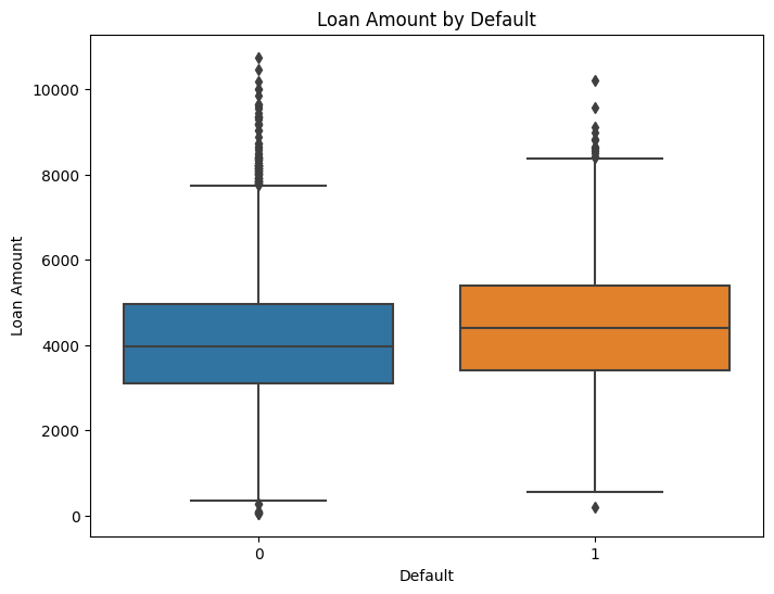
plt.show()A more in depth visualization to compare FICO Score to Debrt-to-Income Ratio for more efficient data driven decision making!
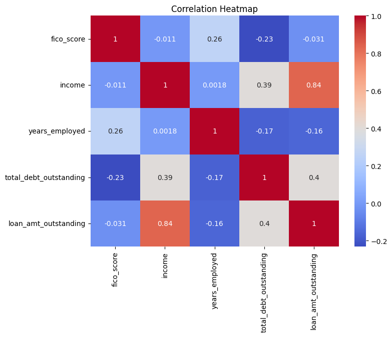
# Correlation Heatmap
corr_matrix = data[['fico_score', 'income', 'years_employed', 'total_debt_outstanding', 'loan_amt_outstanding']].corr()
plt.figure(figsize=(8, 6))
sns.heatmap(corr_matrix, annot=True, cmap='coolwarm')
plt.title('Correlation Heatmap')
plt.show()
A Correlation Matrix is a very useful tool that allows us to better visualize the connected relationships that exist within our data. The warmer the color an area has represents a high probability of being indicative of a greater correlation of statistical significance between variables that are being influenced by key the indicators that we tested for comparison.
Econometrics/Psychometric Population Determinants is a skill that takes a lifetime of improving upon to be able to efficiently use in real life scenarios. Identifying and explaining key trends in Macro Drivers for credit risk, consumer credit quality and customer behavior is no easy task. The ability to Manipulate Big Data into manageable anaytics accurately for better business insights allows for the development of auditable control frameworks for research to be developed, overall resulting in more efficient lending strategies and an optimization of portfolio performance when conveying risk management results utilizing levarge of current cross-consumer outlooks.
Power in Numbers
Project Gallery


