
Investigate and Analyze Price Data
When trading natural gas storage contracts, it is important that the available market data must be of higher quality to enable the instrument to be priced accurately. This entails extrapolating the data available from external feeds to provide more granularity, considering seasonal trends in the price as it relates to months in the year. To price the contract, we will need historical data and an estimate of the future gas price at any date.
Commodity storage contracts represent deals between warehouse (storage) owners and participants in the supply chain (refineries, transporters, distributors, etc.). The deal is typically an agreement to store an agreed quantity of any physical commodity (oil, natural gas, agriculture) in a warehouse for a specified amount of time. The key terms of such contracts (e.g., periodic fees for storage, limits on withdrawals/injections of a commodity) are agreed upon inception of the contract between the warehouse owner and the client. The injection date is when the commodity is purchased and stored, and the withdrawal date is when the commodity is withdrawn from storage and sold.
More details entailing helpful methodolgy used to formulate the solution can be found here: Understanding Commodity Storage.
A client could be anyone who would fall within the commodities supply chain, such as producers, refiners, transporters, and distributors. This group would also include firms (commodities trading, hedge funds, etc.) whose primary aim is to take advantage of seasonal or intra-day price differentials in physical commodities. For example, if a firm is looking to buy physical natural gas during summer and sell it in winter, it would take advantage of the seasonal price differential mentioned above. The firm would need to leverage the services of an underground storage facility to store the purchased inventory to realize any profits from this strategy.
Luckily for us, after asking around we were able to obtain a monthly snapshot of prices from a market data provider, which represents the market price of natural gas delivered at the end of each calendar month. This data is available for roughly the next 18 months and is combined with historical prices in a time series database. We we will use this monthly snapshot to produce a varying picture of the existing price data, as well as an extrapolation for an extra year, in case the client needs an indicative price for a longer-term storage contract.
It is of the highest importance to try to visualize the data to find patterns and consider what factors might cause the price of natural gas to vary. This can include looking at months of the year for seasonal trends that affect the prices, but market holidays, weekends, and bank holidays need not be accounted for.
The monthly natural gas price data can be found below.
Each point in the data set corresponds to the purchase price of natural gas at the end of a month, from 31st October 2020 to 30th September 2024.
We will analyze the data to estimate the purchase price of gas at any date in the past and extrapolate it for one year into the future.
The code should take a date as input and return a price estimate to achieve the highest efficacy.
import os

cwd = ps.getcwd()

print("Current working directory: {0}".format(cwd)

print ("os.getcwd() returns an object of type {0}".format(type(cwd)))

# copy the filepath
os.chdir ("____________")


# let's jump into task 1!

import pandas as pd
import numpy as np
from matplotlib import pyplot as plt
from datetime import date, timedelta

date_time = ["10-2020", "11-2020", "12-2020"]
date_time = pd.to_datetime(date_time)
data = [1, 2, 3]

df = pd.read_csv('Nat_Gas.csv', parse_dates=['Dates'])
prices = df['Prices'].values
dates = df['Dates'].values

# plot prices against dates
fig, ax = plt.subplots()
ax.plot_date(dates, prices, '-')
ax.set_xlabel('Date')
ax.set_ylabel('Price')
ax.set_title('Natural Gas Purchase Prices Over Time')
ax.tick_params(axis='x', rotation=45)
plt.grid(TRue)

plt.show()

# Monthly average prices
monthly_avg_prices = df.groupby(['Month'])['Prices'].mean()

# Visualize monthly average prices
plt.figure(figsize=(8, 6))
plt.plot(monthly_avg_prices.index, monthly_avg_prices.values)
plt.xlabel('Month')
plt.ylabel('Average Price')
plt.title('Monthly Average Natural Gas Purchase Prices')
plt.xticks(range(1, 13))
plt.grid(True)
plt.show()

# Yearly average prices
yearly_avg_prices = df.groupby(['Year'])['Prices'].mean()

# Visualize yearly average prices
plt.figure(figsize=(8, 6))
plt.plot(yearly_avg_prices.index, yearly_avg_prices.values)
plt.xlabel('Year')
plt.ylabel('Average Price')
plt.title('Yearly Average Natural Gas Purchase Prices')
plt.grid(True)
plt.show()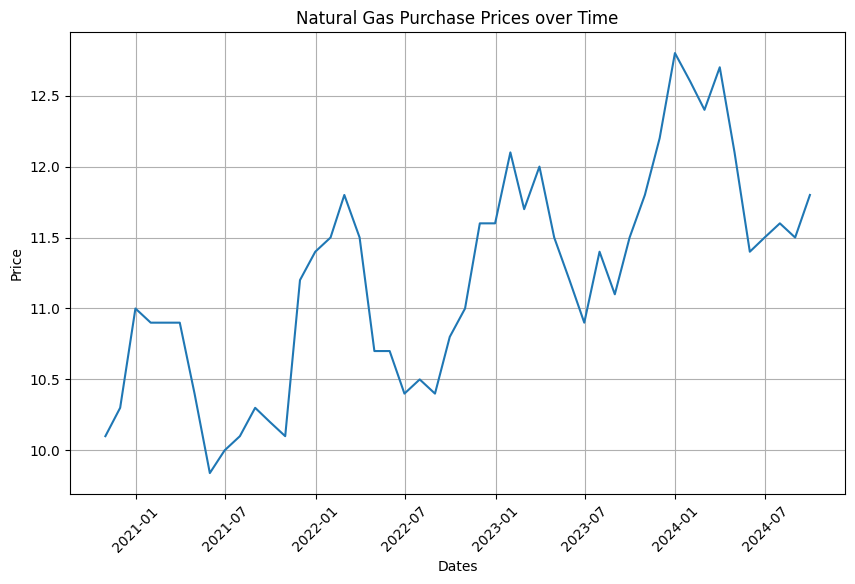
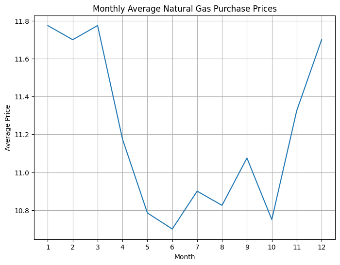
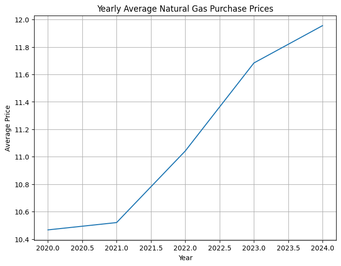
From the plots - we can see the prices have a natural frequency of around a year, but trend upwards.
We can do a linear regression to get the trend, and then fit a sin function to the variation in each year!
# First we need the dates in terms of days from the start, to make it easier to interpolate later.

start_date = date(2020,10,31)
end_date = date(2024,9,30)
months = []
year = start_date.year
month = start_date.month + 1
while True:
    current = date(year, month, 1) + timedelta(days=-1)
    months.append(current)
    if current.month == end_date.month and current.year == end_date.year:
        break
    else:
        month = ((month + 1) % 12) or 12
        if month == 1:
            year += 1

days_from_start = [(day - start_date ).days for day in months]
Simple regression for the trend will fit to a model y = Ax + B. The estimator for the slope is given by \hat{A} = \frac{\sum (x_i - \bar{x})(y_i - \bar{y})}{\sum (x_i - \bar{x})^2},
#and that for the intercept by \hat{B} = \bar{y} - hat{A} * \xbar
def simple_regression(x, y):
    xbar = np.mean(x)
    ybar = np.mean(y)
    slope = np.sum((x - xbar) * (y - ybar))/ np.sum((x - xbar)**2)
    intercept = ybar - slope*xbar
    return slope, intercept

# Plot linear trend
plt.figure(figsize=(10, 6))
plt.plot(time, prices)
plt.plot(time, time * slope + intercept)
plt.xlabel('Days from start date')
plt.ylabel('Price')
plt.title('Linear Trend of Monthly Input Prices')
plt.xticks(rotation=45)
plt.grid(True)
plt.show()
print(slope, intercept)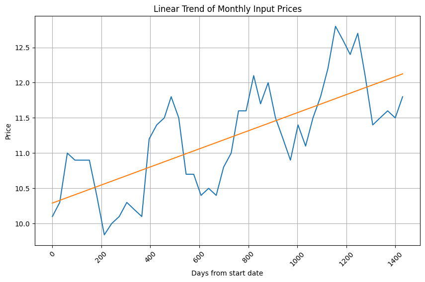
From this plot we see the linear trend has been captured. Now to fit the intra-year variation!
Given that natural gas is used more in winter, and less in summer, we can guess the frequency of the price movements to be about a year, or 12 months.
Therefore we have a model y = Asin( kt + z ) with a known frequency. Rewriting y = Acos(z)sin(kt) + Asin(z)cos(kt),
we can use bilinear regression, with no intercept, to solve for u = Acos(z), w = Asin(z)
sin_prices = prices - (time * slope + intercept)
sin_time = np.sin(time * 2 * np.pi / (365))
cos_time = np.cos(time * 2 * np.pi / (365))

def bilinear_regression(y, x1, x2):
    # Bilinear regression without an intercept amounts to projection onto the x-vectors
    slope1 = np.sum(y * x1) / np.sum(x1 ** 2)
    slope2 = np.sum(y * x2) / np.sum(x2 ** 2)
    return(slope1, slope2)

slope1, slope2 = bilinear_regression(sin_prices, sin_time, cos_time)
We now recover the original amplitude and phase shift as A = slope1 ** 2 + slope2 ** 2, z = tan^{-1}(slope2/slope1)
amplitude = np.sqrt(slope1 ** 2 + slope2 ** 2)
shift = np.arctan2(slope2, slope1)

# Plot smoothed estimate of full dataset
plt.figure(figsize=(10, 6))
plt.plot(time, amplitude * np.sin(time * 2 * np.pi / 365 + shift))
plt.plot(time, sin_prices)
plt.title('Smoothed Estimate of Monthly Input Prices')
plt.xticks(rotation=45)
plt.legend()
plt.grid(True)
Define the interpolation/extrapolation function
def interpolate(date):
    days = (date - pd.Timestamp(start_date)).days
    if days in days_from_start:
        # Exact match found in the data
        return prices[days_from_start.index(days)]
    else:
        # Interpolate/extrapolate using the sin/cos model
        return amplitude * np.sin(days * 2 * np.pi / 365 + shift) + days * slope + intercept
Create a range of continuous dates from start date to end date
continuous_dates = pd.date_range(start=pd.Timestamp(start_date), end=pd.Timestamp(end_date), freq='D')Plot the smoothed estimate of the full dataset using interpolation
plt.plot(continuous_dates, [interpolate(date) for date in continuous_dates], label='Smoothed Estimate')Fit the monthly input prices to the sine curve
x = np.array(days_from_start)
y = np.array(prices)
fit_amplitude = np.sqrt(slope1 ** 2 + slope2 ** 2)
fit_shift = np.arctan2(slope2, slope1)
fit_slope, fit_intercept = simple_regression(x, y - fit_amplitude * np.sin(x * 2 * np.pi / 365 + fit_shift))
plt.plot(dates, y, 'o', label='Monthly Input Prices')
plt.plot(continuous_dates, fit_amplitude * np.sin((continuous_dates - pd.Timestamp(start_date)).days * 2 * np.pi / 365 + fit_shift) + (continuous_dates - pd.Timestamp(start_date)).days * fit_slope + fit_intercept, label='Fit to Sine Curve')

plt.xlabel('Date')
plt.ylabel('Price')
plt.title('Natural Gas Prices')
plt.grid(True)
plt.legend()
plt.show()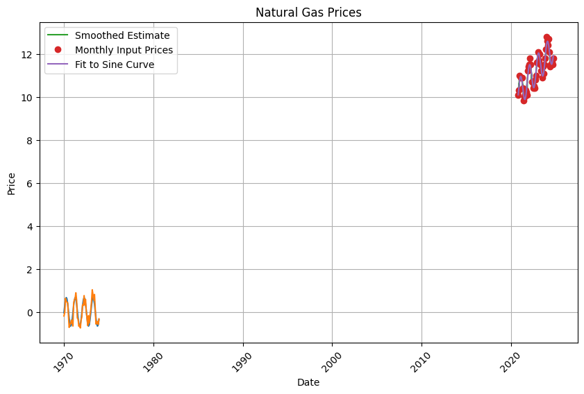
As one can see, Quantitative Research often requires the knowledge and utilization of data analysis and machine learning. It is evident that Python can be a useful tool and one that is capable of completing complex tasks if utilized properly.
This is a list for reference and check that I recieved when extrapolating the data for further testing of a nueral network I am building (remember to take into account holidays/leap years into your algorithims and that you are more than free to test other dates to explore patterns you may find. My nueral network is almost accurate until 2028 with a day-month-year input before becomng innacurate by a 0.3357-.5338 range).
Power in Numbers
Project Gallery


